Component Based Design System With Styled-System
Component-based design system is the practice of splitting the UI into small, isolated and more manageable parts; backed by a set of design constraints. It builds upon ideas such as Atomic Design, Style Guides and Component-Based Architecture. In my previous, post I introduced some foundational concepts of component-based design systems and shared my approach to building one with Tachyons and React. I now want to focus on a different tool called Styled-System which uses a Tachyons like API while giving you a lot more control over the design system implementation.
Styled System
Styled-System provides you with a set of utilities that map props to your design system. It uses the concept of style functions. Each style function exposes its own set of props that style elements based on values defined in your design system theme. It has a rich API with functions for most CSS properties.
You need to pair the style functions with a CSS-in-JS library to build a component. It works with most CSS-in-JS libraries and even supports Vue. I will be using styled-components for all the examples in this blog post.
import { space, width, fontSize, color } from 'styled-system';
import styled, { ThemeProvider } from 'styled-components';
import theme from './theme';

const Box = styled.div`
  ${space}
  ${width}
  ${fontSize}
  ${color}
`;

render(
  <ThemeProvider theme={theme}>
    <Box p={3} bg="whites.10" color="orange">
      This is a Box
    </Box>
  </ThemeProvider>
);
Design Constraints Theme
You define your design system as a theme object (example below) and then provide it using the ThemeProvider component.
export const theme = {
  breakpoints: [32, 48, 64],
  space: [0, 4, 8, 16, 32, 64, 128, 256, 512],
  fontSizes: [12, 14, 16, 20, 24, 36, 48, 80, 96],
  fontWeights: [100, 200, 300, 400, 500, 600, 700, 800, 900],
  lineHeights: {
    solid: 1,
    title: 1.25,
    copy: 1.5,
  },
  letterSpacings: {
    normal: 'normal',
    tracked: '0.1em',
    tight: '-0.05em',
    mega: '0.25em',
  },
  fonts: {
    serif: 'athelas, georgia, times, serif',
    sansSerif:
      '-apple-system, BlinkMacSystemFont, "avenir next", avenir, "helvetica neue", helvetica, ubuntu, roboto, noto, "segoe ui", arial, sans-serif',
  },
  borders: [
    0,
    '1px solid',
    '2px solid',
    '4px solid',
    '8px solid',
    '16px solid',
    '32px solid',
  ],
  radii: [0, 2, 4, 16, 9999, '100%'],
  width: [16, 32, 64, 128, 256],
  heights: [16, 32, 64, 128, 256],
  maxWidths: [16, 32, 64, 128, 256, 512, 768, 1024, 1536],
  colors: {
    black: '#000',
    'near-black': '#111',
    'dark-gray': '#333',
    'mid-gray': '#555',
    gray: ' #777',
    silver: '#999',
    'light-silver': '#aaa',
    'moon-gray': '#ccc',
    'light-gray': '#eee',
    'near-white': '#f4f4f4',
    white: '#fff',
    transparent: 'transparent',
    blacks: [
      'rgba(0,0,0,.0125)',
      'rgba(0,0,0,.025)',
      'rgba(0,0,0,.05)',
      'rgba(0,0,0,.1)',
      'rgba(0,0,0,.2)',
      'rgba(0,0,0,.3)',
      'rgba(0,0,0,.4)',
      'rgba(0,0,0,.5)',
      'rgba(0,0,0,.6)',
      'rgba(0,0,0,.7)',
      'rgba(0,0,0,.8)',
      'rgba(0,0,0,.9)',
    ],
    whites: [
      'rgba(255,255,255,.0125)',
      'rgba(255,255,255,.025)',
      'rgba(255,255,255,.05)',
      'rgba(255,255,255,.1)',
      'rgba(255,255,255,.2)',
      'rgba(255,255,255,.3)',
      'rgba(255,255,255,.4)',
      'rgba(255,255,255,.5)',
      'rgba(255,255,255,.6)',
      'rgba(255,255,255,.7)',
      'rgba(255,255,255,.8)',
      'rgba(255,255,255,.9)',
    ],
    // ... and so on
  },
};
Style functions will try to find a value from the theme object, these could be deeply nested values, and fallback to a hard-coded value if they are unable to.
// font-size: 24px (theme.fontSizes[4])
<Box fontSize={4} />

// margin: 16px (theme.space[3])
<Box m={2} />

// color: #333 (theme.colors.blacks[0])
<Box color="blacks.3" />

// background color (theme.colors['light-red'])
<Box bg="light-red" />

// line-height: 1.5 (theme.lineHeights.copy)
<Box lineHeight="copy" />

// renders CSS `50%` width since it's not defined in theme
<Box width={1/2} />
Responsive Style Props
All core props accept arrays as values for specifying responsive styles. Refer to the Table of Style Props to see which props support responsive values.
<Box
  width={[
    1, // 100% below the smallest breakpoint
    1 / 2, // 50% from the next breakpoint and up
    1 / 4, // 25% from the next breakpoint and up
  ]}
/>

// responsive font size
<Text fontSize={[ 2, 3, 4 ]} />
System Components
If you have settled on using styled-components with styled-system, then you can get an even simpler authoring experience by using system-components — a lightweight wrapper around those two libraries.
That’s a lot of libraries with similar sounding names 😅 To avoid confusion, here’s a quick overview of the ecosystem:
system-components
simpler authoring experience to create design-system-driven React UI components
Additional features such as default value for props & is prop
clean-tag & clean-element
removes styled-system props from the underlying DOM elements
styled-system
framework agnostic design system utilities
styled-components
a css-in-js library
Let’s start by creating a <Box /> primitive. I would recommend applying the core functions to all components. Beyond that, it depends on the component you are building. For the <Box /> component I include border, layout, flex and position functions.
import system from 'system-components';

const Box = system(
  // core
  'space',
  'width',
  'color',
  'fontSize',
  // borders
  'borders',
  'borderColor',
  'borderRadius',
  // layout
  'display',
  'maxWidth',
  'minWidth',
  'height',
  'maxHeight',
  'minHeight',
  // flexbox
  'alignItems',
  'alignContent',
  'justifyContent',
  'flexWrap',
  'flexDirection',
  'flex',
  'flexBasis',
  'justifySelf',
  'alignSelf',
  'order',
  // position
  'position',
  'zIndex',
  'top',
  'right',
  'bottom',
  'left'
);
Box.displayName = 'Box';
System-components used clean-tag and clean-element to strip out styled-system props automatically. Preventing them from passing down onto the underlying DOM elements. It allows you to control which DOM element is rendered by using the is prop. And you can also specify default values for all the props.
System-components automatically apply styled-system functions based on the keys of the default values object. In the example below, <Text /> will have fontSize, color and fontFamily functions automatically applied so, you don’t need to list them out.
This is honestly my favourite way to build UI components right now 
const Text = system(
  {
    is: 'p',
    fontSize: 2,
    color: 'dark-gray',
    fontFamily: 'sansSerif',
  },
  'space',
  'width',
  'textAlign',
  'lineHeight',
  'fontWeight',
  'letterSpacing'
);
Text.displayName = 'Text';

const Heading = system(
  {
    is: 'h1',
    m: 0,
    fontSize: 6,
    color: 'dark-gray',
    fontFamily: 'sansSerif',
  },
  'width',
  'textAlign',
  'lineHeight',
  'fontWeight',
  'letterSpacing'
);
Heading.displayName = 'Heading';
In the previous, post I had created a Profile Card component. Here’s the whole example recreated with system-components.

import React from 'react';
import { Card, Box, Heading, Text, Avatar } from './design-system';

export const ProfileCard = ({ image, name, title, ...props }) => (
  <Card {...props} p={[3, 4, 4]} borderColor="blacks.3">
    <Box textAlign="center">
      <Avatar width={3} height={3} mb={2} borderColor="blacks.2" src={image} />
      <Heading is="h2" fontSize={4} mb={2}>
        {name}
      </Heading>
      <Text fontSize={2} my={0}>
        {title}
      </Text>
    </Box>
  </Card>
);
Input With Adornment Example
Moving onto some more complex examples. The <InputWithAdornment/> component allows you to place an adornment before or after an input. The adornment can be a bit of text, an icon or any valid node.
One possible way of building this is to wrap an HTML <input /> and containers for the adornments in a <Box />. The adornment containers are absolutely positioned while the input has padding to make room for the adornment.
You can pass in any node to the before and after props, while all other props are spread onto the <input /> element so as not to limit any functionality.
const InputWithAdornment = ({ before, after, disabled, ...props }) => (
  <Box display="flex" alignItems="center" position="relative">
    {before && (
      <Adornment left="0" pl={2} disabled={disabled}>
        {before}
      </Adornment>
    )}
    <HtmlInput
      py={2}
      pl={before ? 4 : 2}
      pr={after ? 4 : 2}
      disabled={disabled}
      {...props}
    />
    {after && (
      <Adornment right="0" pr={2} disabled={disabled}>
        {after}
      </Adornment>
    )}
  </Box>
);
Extending Components
System-components generate styled-components, allowing you to use all built-in methods such as .extend. <Adornment /> is a <Box /> extended to have an absolute position and a style function to control opacity based on the disabled prop.
const Adornment = Box.extend`
  position: absolute;
  opacity: ${props => (props.disabled ? 0.25 : 1)};
`;
Using Custom Functions
You can also pass in custom style functions to the system function. The function signature is system(defaultValues, styleFn1, styleFn2, ... customStyleFn). For the <HtmlInput /> component a custom style function adds styling for focus and disabled states. themeGet is a utility to get a value from your theme.
import { themeGet } from 'styled-system';

const HtmlInput = system(
  {
    is: 'input',
    type: 'text',
    fontFamily: 'sansSerif',
    fontSize: 'inherit',
    p: 0,
    m: 0,
    lineHeight: 'solid',
    width: 4,
    color: 'mid-gray',
    bg: 'white',
    border: 1,
    borderRadius: 2,
    borderColor: 'moon-gray',
  },
  props => ({
    display: 'inline-block',
    verticalAlign: 'middle',
    appearance: 'none',
    flex: '1 0 auto',
    '&:focus': {
      outline: 'none',
      borderColor: themeGet('colors.blue')(props),
    },
    '&:disabled': {
      opacity: 0.25,
      backgroundColor: themeGet('colors.light-gray')(props),
    },
  })
);
Product Card Example
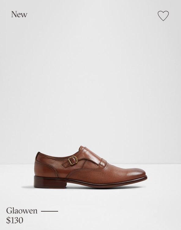
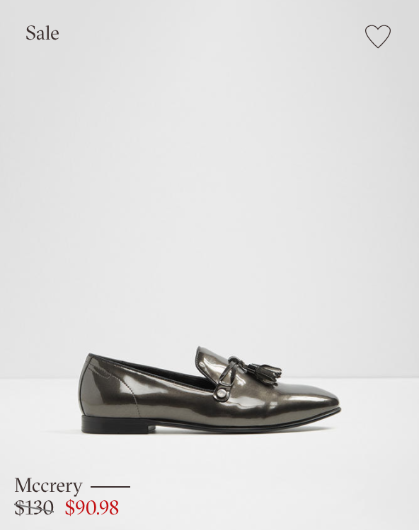
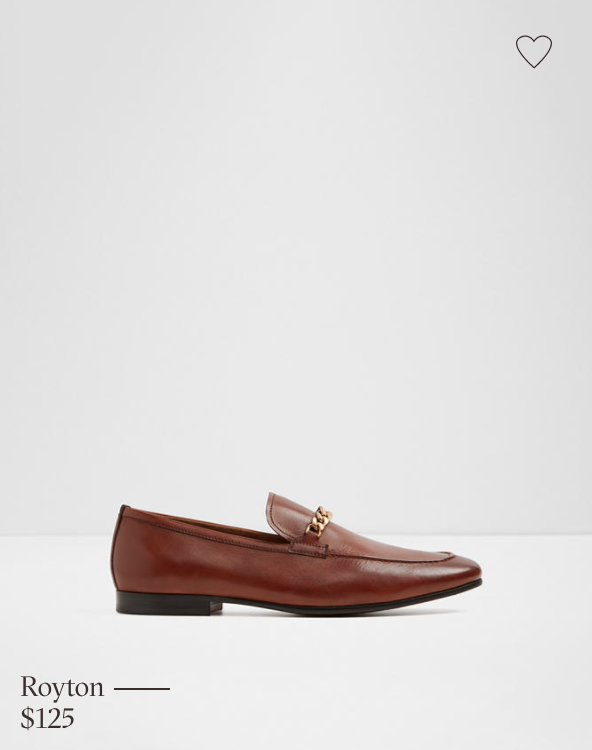
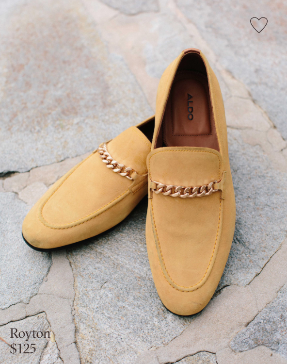
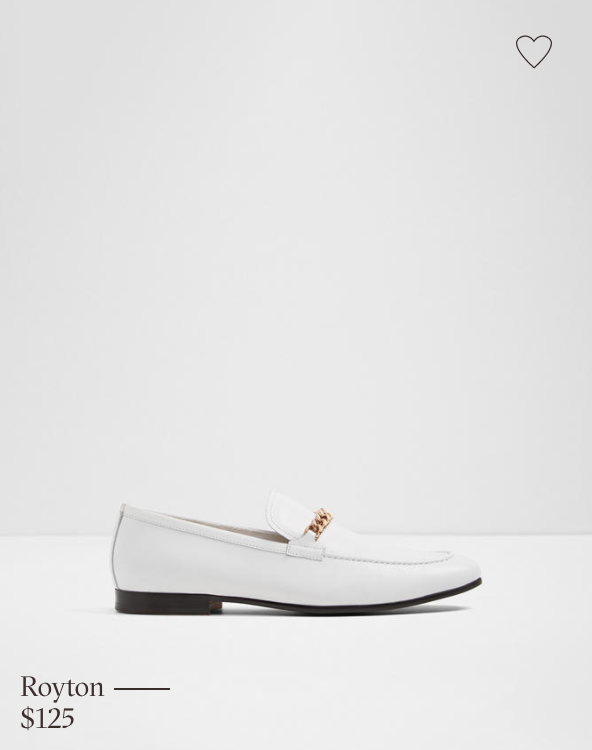
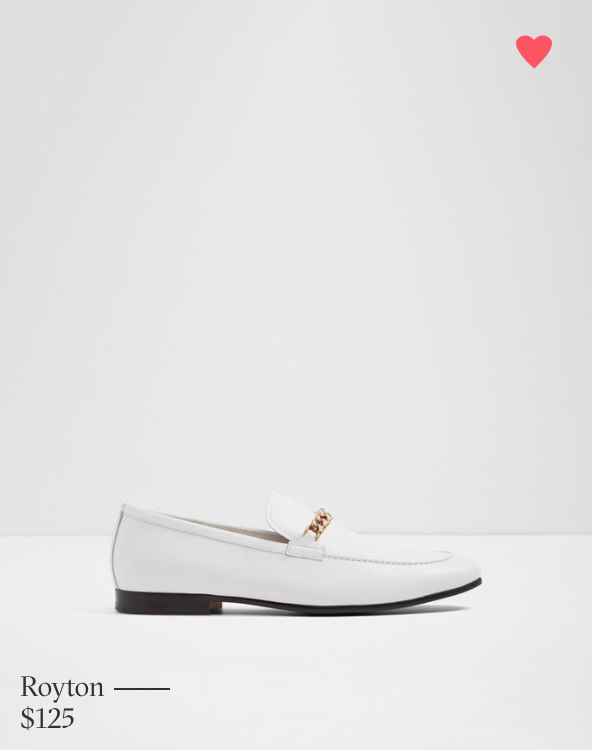
The Aldo product card is perfect for demonstrating the power of composition. It displays an image with a particular aspect ratio. Its other contents change based on the status of the product.
A more generic form of this component is the <ImageCard /> component. It consists of a <BackgroundImage /> component and containers for content that can be absolutely positioned on top of it. All wrapped in a <Box />.
<BackgroundImage /> is essentially the same as Rebass’ BackgroundImage component. It uses the padding technique to render images in a specific aspect ratio.
const BackgroundImage = system(
  {
    width: 1,
    ratio: 3 / 4,
    backgroundSize: 'cover',
    backgroundPosition: 'center',
    blacklist: ['src'],
  },
  'space',
  'color',
  'fontSize',
  'ratio',
  props => ({
    backgroundImage: props.src ? `url(${props.src})` : undefined,
  })
);
Notice how you can use the blacklist prop to prevent props from passing onto the DOM element.
The absolutely positioned content containers use <Box />. Alternatively, you could create an Absolute component. The wrapper <Box /> has all other props spread onto it. Allowing you to the control the size and layout of the entire component.
const ImageCard = ({ tl, tr, br, bl, src, ratio, ...props }) => (
  <Box position="relative" {...props}>
    <BackgroundImage width="100%" ratio={ratio} src={src} />
    {tl && (
      <Box position="absolute" top={0} left={0}>
        {tl}
      </Box>
    )}
    {tr && (
      <Box position="absolute" top={0} right={0}>
        {tr}
      </Box>
    )}
    {br && (
      <Box position="absolute" bottom={0} right={0}>
        {br}
      </Box>
    )}
    {bl && (
      <Box position="absolute" bottom={0} left={0}>
        {bl}
      </Box>
    )}
  </Box>
);
The <ProductCard /> is a more domain-specific version of the <ImageCard />. It holds the logic to display the appropriate product-tag, pricing and the favourite button. See the CodeSandbox below for the implementation of those other components.
const ProductCard = ({ shoe, ...props }) => (
  <ImageCard
    ratio={803 / 632}
    src={shoe.image}
    {...props}
    tl={shoe.status && <ProductTag>{statusText(shoe.status)}</ProductTag>}
    tr={<FavouriteButton p={2} m={2} isFavourite={shoe.favourite} />}
    bl={
      <Box ml={3} mb={2}>
        <HeadingWithDash dashWidth={1} fontSize={1} lineHeight="solid" mb={1}>
          {shoe.name}
        </HeadingWithDash>
        <Price {...shoe} />
      </Box>
    }
  />
);
These are just a few examples that demonstrate how you can use styled-system. There are other features such as complex-styles, pseudo-styles and even creating custom style utilities for you to explore. For further real-world examples check out Rebass and Priceline Design System.
In my opinion, styled-system is a genuinely fantastic tool for building a component-based design system. It manages to get the balance right between flexibility and maintainability.