Components
Everything is a component. It took me a surprisingly long time to come to terms with this idea.
I learnt to build UIs using templates. These templates were driven by routing. The routing structure of the app dictated how the UI was sliced up.
I mostly worked with AngularJS with MVVM architecture. Initially, these views had massive templates. Switching to UI-Router forced me to break them down a bit more; this was because UI-Router supported nested routes. There were some chunks of the UI which fit the component ideology, for example, modals and forms. However, that was rare.
Making the switch to components was hard. There were no apparent boundaries for a view. What is a component? What is the right level at which to slice a component? I struggled with this a lot. I know I am not the only one. I often saw other people taking the template style approach to components. Creating large components that handled everything from design language to UI logic and state.
It turns out we all sort of knew what the right answer was. Designers had been using symbols in design tools to break down the UI and create appropriate abstractions. Developers did the same thing in CSS with BEM and other such techniques. We were all reasoning about the UI in similar ways. We weren’t extending that approach to the way we built it, or at least I wasn’t.

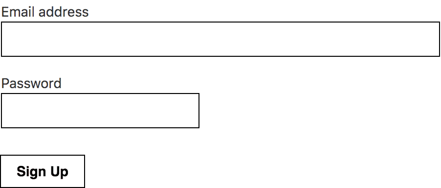
Everything is a component. The Sign-up form above is a component. The Button, Labels, Inputs and FieldGroups are components too.
UI System
Your UI is a system of components; where each component should be flexible, independent, reusable and often stateless. Start small, use a design system and compose variations & complexity.
A well-designed UI system should be composable. Much like functions are composed together to complete more complex tasks. Components can be composed together to create more complex UI patterns. See my previous blog post for a deeper dive on this subject.
Component Dichotomy
Like many, I started by applying the concepts of Atomic Design to components; creating a hierarchy of components — atoms, molecules, organisms & containers. In hindsight, these classifications were helpful guides but, not something that was necessary. In some cases, this even introduced unnecessary restrictions. I now use more of an “everything is a composition” approach as outlined in Daniel Eden’s theory of Subatomic Design Systems.
Design System constraints or variables are the lowest level building blocks. Compose them with HTML/JSX/etc. to create the first set of components. These form the foundation of your component-based design system. Compose them into UI patterns. State is yet another layer of composition.
At some point, these compositions become more aware of the product that they belong to. A language emerges. A product-specific language shared between designers and developers. Which allows you to discuss ideas using abstracted components and not get lost in the minutia of rems, pixels and hex codes.
Further reading
- Components by Brent Jackson
- Developing UI by Adam Morse
- Chris Biscardi’s twitter thread