Parallax With Angular
Lately I’ve been obsessed with Monument Valley. Love the game and the aesthetic even more. I even set up my Electric Object EO1 with a “print” from the game. So, I just had to build something inspired by it – why not a Tintin/Monument Valley mash-up?
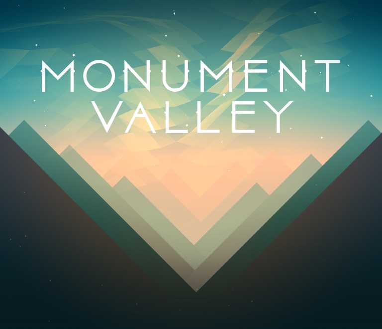
The starting point was this image. The shapes and gradients are easy to replicate with SVG. And instead of worrying about the low-poly sky I decided to focus on introducing some parallax effect.

SVG with AngularJS
For my day job I primarily work with Angular and I was curious to see how the whole dynamically composed SVG thing would work out with it. So, instead of React + SVG this time it is Angular + SVG.
Adopting the same technique as React the SVG layers are just components – known as directives in the Angular world. To create a directive that renders SVG you need to specify templateNamespace: 'svg'. This allows you to have templates that contain SVG partials.
I call the top level component in this case the valley directive. This is where the SVG starts and the template for it is simply:
<svg xmlns="http://www.w3.org/svg/2000" width="100%" height="100%">
  <g ng-transclude></g>
</svg>
Now, since we are composing these layers in markup we need to set transclude: true for this directive. Angular by default strips the content within the directive tags. Enabling transclude allows us to have nested content, like so:
<valley id="valley" dx="main.dx" dy="main.dy">
  <defs ng-include="'templates/gradients'"> </defs>
  <g ng-repeat="peak in main.peaks">
    <peak
      fill="{ { peak.fill }}"
      w="main.width"
      h="main.height"
      def="peak.left"
      dx="main.dx"
      dy="main.dy"
      ng-attr-opacity="{ { peak.opacity }}"
    ></peak>
    <peak
      fill="{ { peak.fill }}"
      w="main.width"
      h="main.height"
      def="peak.right"
      dx="main.dx"
      dy="main.dy"
      ng-attr-opacity="{ { peak.opacity }}"
    ></peak>
  </g>
  <g
    mountain-range
    fill="url(#black-gradient)"
    w="main.width"
    h="main.height"
    dx="main.dx"
    dy="main.dy"
  >
  </g>
</valley>
Constructing the Shapes
I decided to construct the black peaks 🌄 in the front as one shape in the mountain-range directive. The shape is simply a path element. The path is made of 5 vertices… it’s like connect the dots:
2*               *4

        3*

1*               *5
All the other peaks were constructed individually using the peak directive. The shape here is once again a path but with 3 vertices. Let’s connect the dots again:
        2*


1*               *3
Now that shape is ready we can focus on the parallax. Parallax effect is a simple technique to fake 3D-ish in 2D. This would be achieved by moving the peaks in the back by a larger distance than those in the front.
On the iPhone you might have noticed the parallax effect when you tilt your phone. While that is awesome and can be replicated with JS I chose to simply use the mouse pointer to drive the parallax.
Tracking the Mouse
The mousemove event gives use the mouse position: event.pageX & event.pageY. This position is relative to the window. We only care about the position inside the card. So, to calculate the position relative to the card we use:
var cardInfo = cardElement.getBoundingClientRect();
var mouseX = event.pageX - cardInfo.left;
var mouseY = event.pageY - cardInfo.top;
We have the mouse coordinates relative to the card. However, the origin for these coordinates is the top left corner of the card. For the parallax effect it would be helpful to move the origin to the centre of the card – makes the math easier. For that we do a little transformation:
var cardInfo = cardElement.getBoundingClientRect();
var mouseX = event.pageX - cardInfo.left;
var mouseY = event.pageY - cardInfo.top;

var w = cardInfo.width;
var h = cardInfo.height;

var transformedMouseX = -(w / 2 - x);
var transformedMouseY = h / 2 - y;
And finally we map & constrain these values between -1 and 1 (again, to make the math easier).
// Re-maps a number from one range to another
function map(n, start1, stop1, start2, stop2) {
  return ((n - start1) / (stop1 - start1)) * (stop2 - start2) + start2;
}
See the Pen Mouse Position by Varun Vachhar (@winkerVSbecks) on CodePen.
The Parallax
The easiest way to move the peaks is to use CSS transforms. We could manipulate the path too but, that gets a bit more complex.
<path ng-attr-d="{ { peak.d() }}" ng-attr-transform="{ { peak.translate() }}">
</path>
You’ll notice the ng-attr prefix. We need this because the transform value is calculated dynamically based on the mouse position:
If an attribute with a binding is prefixed with the ng-attr prefix… allows you to bind to attributes that would otherwise be eagerly processed by browsers (e.g. an SVG element's circle[cx] attributes).
—docs.angularjs.org/guide/directive
Each peak can be displaced by a maximum amount in the X and Y direction. The SVG is responsive therefore, we need to dynamically calculate the pixel value using the width and height of the SVG.
// Ratio is a number between 0 & 1
var xBase = svgWidth * ratio;
var yBase = svgHeight * ratio;
To achieve the parallax effect each peak needs a different ratio. It’s largest for the peak in the back and reduces as we go forward. The translate value is calculated by mapping the normalized mouse position from -xBase to xBase.
var xBase = svgWidth * ratio;
var yBase = svgHeight * ratio;
var xAmt = map(normalizedMouseX, -1, 1, -xBase, xBase);
var yAmt = map(normalizedMouseY, -1, 1, -yBase, yBase);

var translate = 'translate(' + xAmt + ',' + yAmt + ')';
See the Pen parallax step 1 by Varun Vachhar (@winkerVSbecks) on CodePen.
The card movement works in a similar fashion. Except we have to rotate the card instead of translate.
var yRotation = map(normalizedMouseX, -1, 1, 10, -10);
var xRotation = map(normalizedMouseX, -1, 1, 5, -5);

return {
  transform:
    'rotateX(' +
    xRotation +
    'deg)' +
    ' rotateY(' +
    yRotation +
    'deg) rotateZ(0deg)',
};
Mix all the ingredients together for a parallax filled card.
