React Icon System
Icons play a crucial role in interface design. They can certainly be used as visual embellishments, but they are quite often able to convey their meaning without additional text, making them a handy tool for designers & developers. There are many different ways to build icon systems. In the past, I have written about a sprite based technique. Since then, tooling has matured and there are better approaches. This article will show you how to set up an icon system using SVGR — a tool for transforming SVGs into React components.
Prepare the SVG Files
Our starting point will be SVG files – one per icon. You will likely use design tools like Figma, Illustrator or Sketch to create these.
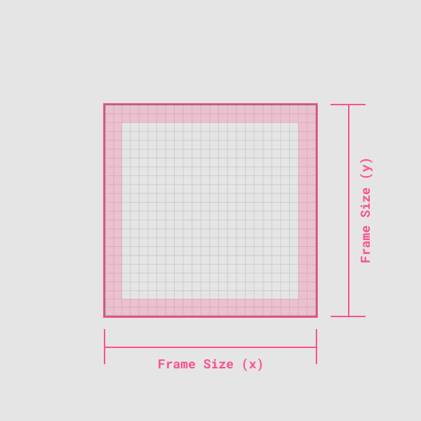
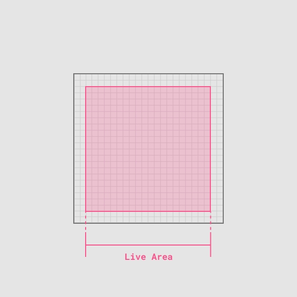
When designing these icons, consider using a consistent artboard size. This ensures that all icons follow the same layout rules and can be used interchangeably. You should also consider adding a bit of padding to your artboard to keep the icon content visually centred.


Generating the Icon Components
SVGR converts SVG files into React components. It is available as a Node library, a CLI tool and a webpack plugin.
Create React App comes pre-configured with SVGR. You can import an SVG file and use it as a component. This is a great start. It reduces the effort required to use SVGs with React.
import { ReactComponent as Logo } from './logo.svg';
function App() {
  return (
    <div>
      {/* Logo is an actual React component */}
      <Logo />
    </div>
  );
}
By using the SVGR CLI, you can customize the component generation and improve your workflow further. You can provide a custom template for component generation and even transform the SVG itself. To start, install the CLI using:
$ npm install @svgr/cli --save-devTo create an icon, run:
$ npx svgr --icon --replace-attr-values "#000=currentColor" my-icon.svgNotice, the --icon flag. It performs a couple of important tasks for us:
- It sets the width and height values to
1emto make the SVG scale with the inherited font-size. - It preserves
viewBoxto ensure that the SVG scales with the correct aspect ratio.
The --replace-attr-values "#000=currentColor" flag replaces the chosen color with currentColor, allowing you to control the icon color using the font-color CSS property.
Behind the scenes, SVGR also uses SVGO to optimize the SVG file before converting it into a component. This is a sample of what you can expect the output to look like:
import * as React from 'react';

function SvgMyIcon(props) {
  return (
    <svg
      width="1em"
      height="1em"
      viewBox="0 0 24 24"
      fill="none"
      stroke="currentColor"
      strokeWidth={2}
      strokeLinecap="round"
      strokeLinejoin="round"
      {...props}
    >
      <path d="M22 12h-4l-3 9L9 3l-3 9H2" />
    </svg>
  );
}

export default SvgMyIcon;
To transform an entire directory of icons, use:
$ npx svgr --icon --replace-attr-values "#000=currentColor" -d icons iconsI generally treat these generated icon components as build artifacts. All the SVG files live in an icon directory, and the .js files within that directory are ignored by git. Then use an npm task to generate the icon components at build time.
{
  ...
  "scripts": {
    "start": "react-scripts start",
    "build": "react-scripts build",
    "prebuild": "npm run icons",    "test": "react-scripts test",
    "eject": "react-scripts eject"
    "icons": "svgr --icon --replace-attr-values '#000=currentColor' -d src/icons src/icons"  }
}
Customizing the Icon Component
You can provide a custom template to modify the generated component code. The template below creates an icon component that leverages styled-components to control its styling.
function template(
  { template },
  opts,
  { imports, componentName, props, jsx, exports }
) {
  const styledComponentName = 'Styled' + componentName;

  return template.ast`
    ${imports}
    import styled from 'styled-components';

    const SVG = (${props}) => ${jsx};

    const ${componentName} = styled(SVG)\`
      display: \${(props) => (props.block ? 'block' : 'inline-block')};
      font-size: \${(props) => (props.fontSize ? props.fontSize : '16px')};
      color: \${(props) => (props.color ? props.color : '#ccc')};
      vertical-align: middle;
      shape-rendering: inherit;
      transform: translate3d(0, 0, 0);
    \`;

    export default ${componentName};
  `;
}

module.exports = template;
For the Radius design system, we are using TypeScript, styled-components and styled-system. Our custom template generated icons that are correctly typed and appropriately connected to our design tokens.
Compound Icons Component
We can further simplify the icons’ usage by combining all the generated icons into one compound Icons component.
import { Icons } from 'ds';

export const App = () => (
  <>
    <Icons.Airplay aria-title="airplay the video" />
    <Icons.AlertCircle aria-title="error" />
  </>
);
SVGR allows us to specify a custom index template. This template is used to generate the index.js file when transforming a directory of SVGs. The following template generates a compound component.
const path = require('path');

function indexTemplate(files) {
  const compoundExportEntries = [];

  const importEntries = files.map(file => {
    const componentName = path.basename(file, path.extname(file));
    compoundExportEntries.push(componentName);

    return `import { default as ${componentName} } from './${componentName}';`;
  });

  return `${importEntries.join('\n')}

    export const Icons = {
      ${compoundExportEntries.join(',\n  ')}
    };
  `;
}

module.exports = indexTemplate;
It adds an import statement for all the components, generates a name for the component based on the file name and finally combines them all into the Icons object.
import { default as Activity } from './Activity';
import { default as Airplay } from './Airplay';
import { default as AlertCircle } from './AlertCircle';
import { default as AlertOctagon } from './AlertOctagon';

export const Icons = {
  Activity,
  Airplay,
  AlertCircle,
  AlertOctagon,
};
And here is the final version of the npm task:
{
  "scripts": {
    ...
    "icons": "svgr --icon --replace-attr-values '#000=currentColor' --template icon-template.js --index-template ./icon-index-template.js -d src/icons src/icons"
  }
}
SVGR is a fantastic tool. You can use it out of the box with Create React App. You can also customize it to better fit your workflow. The full code for this example is available here. For a more complex example, I recommend checking out the Radius source-code.