Component Based Design System With Tachyons
A Design system is a collection of rules, constraints and principles applied to your design and development process. I most often encounter it as a set of rules that control the typography, colours, spacing, sizing, icons and other visual styles. These rules form a foundation that guides your work. They reduce inconsistencies in both design and development implementations yet giving you the room to explore creative solutions.
Tachyons Design System
Tachyons is a functional CSS framework and a design system. If you are new to Tachyons, I suggest starting with Jason Li’s Tachyons CSS Reading List.
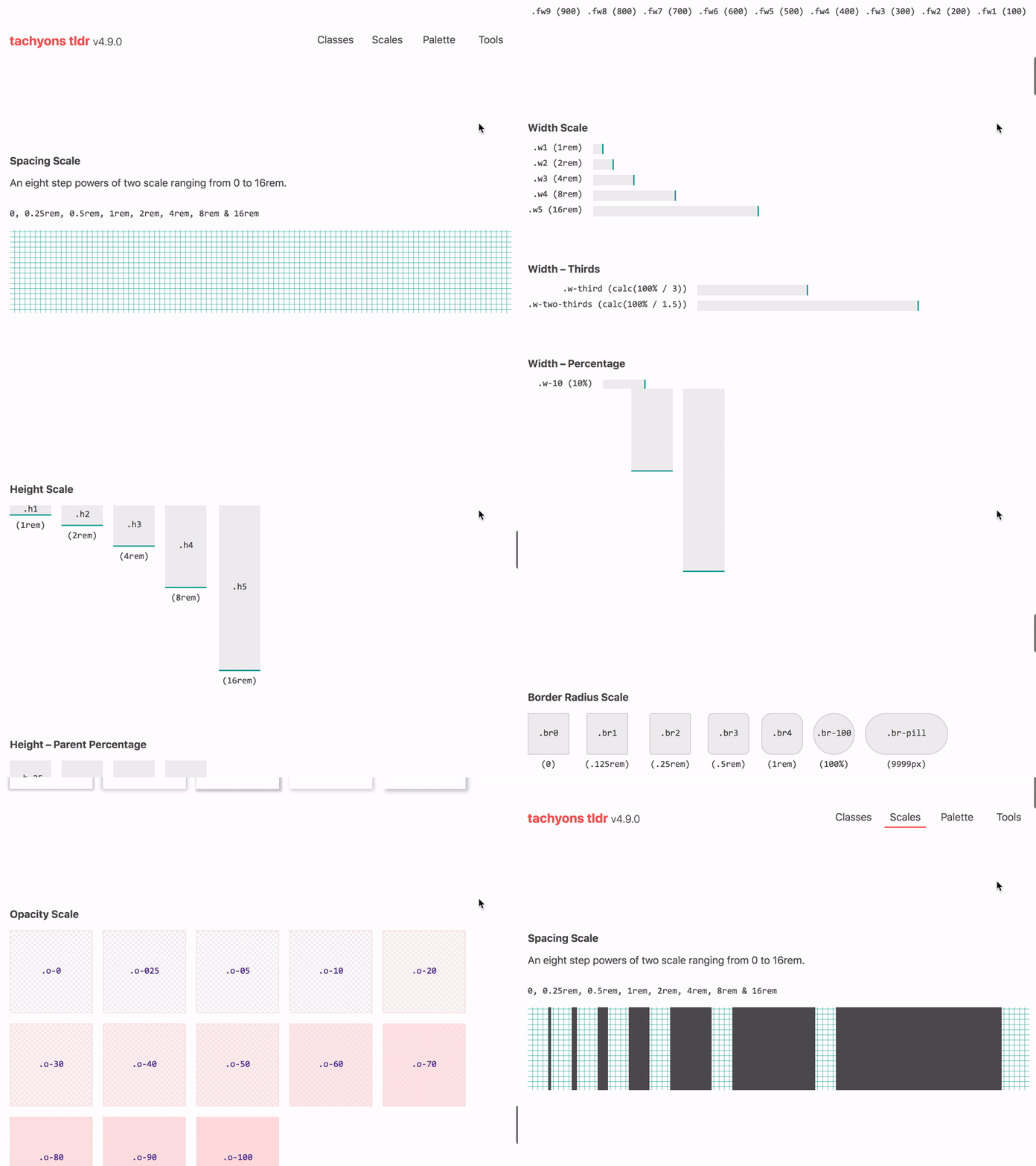
The Tachyons design system uses a spacing scale, based on powers of two, which starts at 0.25rem and modular scale for typography. Other styles such as sizing, borders, opacity and shadows also use scales. It then exposes this design system via a set of immutable classes. For example:
- Typographic scale
.f1–.f7 - Spacing scale
.ma0–.ma7&.pa0–.pa7 - Widths
.w1–.w5 - Max-Widths
.mw1–.mw9
You compose these classes in markup to construct components and layouts, for example, className="f2 mt4 mb2". You have the option to customize this design system using tachyons-css/generator. Alternatively, extend it by writing CSS that follows the same API as that used by Tachyons itself. There are handy tools such as tachyons-tldr to assist you with this.
Component-Based Design System
Having experimented with BEM and modular CSS in the past, I’ve settled on components as my preferred API for a design system. As Michael Chan puts it, “components are a more powerful styling construct than CSS class names.” I wholeheartedly agree! In my experience, composing components has been a much better experience than having to write CSS.
Remember, you are the design system author and your users are other developers. Aim to give them a good user experience.
Using Tachyons is not at all like writing BEM or modular CSS. You rarely have to write CSS. Most of the work tends to be composing classes in templates or JSX. I enjoyed this workflow. However, I did find I was repeating specific tasks often. That is where components come in. They allowed me to abstract out some of those repetitive tasks and hide the implementation details.
In this two-part series, I am going to share techniques that I have used for building component-based design systems. Part one focuses on using Tachyons and part two on using Styled-System.
Tachyons Design System Components
The first, somewhat obvious, approach is to build low-level components that encapsulate styling and allow customization through the className prop.
const Button = ({ className = '', ...props }) => {
  const cx = 'bn f6 dim br2 pv3 ph4 white bg-purple ' + className;
  return <button className={cx} {...props} />;
};

render(<Button>Button Text</Button>);There is a problem with this approach. You won’t always be able to customize the component when using it. For example, <Button className="f7">Button Text</Button> will work because .f7 class is declared after .f6 in the Tachyons stylesheet. However, <Button className="f1">Button Text</Button> won’t work as intended. The .f6 class is declared after .f1 so, it has a higher specificity and will win out.
Design System As Props
You can provide your users with a lot more control by exposing the design system as props. I would suggest using the classNames library to make generating and joining class names a bit easier.
const Button = ({
  f = 6,
  color = 'white',
  bg = 'purple',
  className,
  ...props
}) => {
  const cx = classNames(
    'bn dim br2 pv3 ph4',
    `f${f}`,
    color,
    `bg-${bg}`,
    className
  );

  return <button className={cx} {...props} />;
};

render(
  <div>
    <Button>Update</Button>
    <Button bg="moon-gray" color="dark-gray">
      Cancel
    </Button>
  </div>
);Props 🔀 Design System ➡️ className
I love this pattern of mapping props onto the Tachyons design system and outputting class names. So, simple yet so effective. It allows you to build extremely reusable components that have base styling applied to them and accept overrides via props. You can choose to limit what is customizable depending on the component you are building.
You might notice a few missing features here such as media query support and type checking props. Plus it is going to be quite cumbersome to have to keep repeating this pattern for all your components.
withDesignSystem Higher-Order Component
You can create a higher-order component (HOC) that encapsulates the functionality of mapping props to the Tachyons design system. See the CodeSandbox below for a sample implementation. Tachyons-measured, while no longer maintained, shows how you can add media query support to this HOC.
You can use this HOC to enhance elements or other components into design system components quickly. A good place to get started is by creating a whole bunch of primitives. These are essentially HTML elements styled in accordance with your product’s design language and enhanced by withDesignSystem. For example:
- Box (general purpose layout component)
- Text & Heading
- Image & Avatar (circular image)
- Button & Link
- Input, TextArea & Label
Beyond that, I would suggest looking at Rebass’ documentation. It is a fantastic example of the type of low-level primitives you should be building.
export const Box = withStyleProps('div');
Box.displayName = 'Box';

export const Text = withStyleProps('p');
Text.displayName = 'Text';

export const Heading = withStyleProps(({ level = 1, children, ...props }) => {
  return React.createElement('h' + level, props, children);
});
Heading.displayName = 'Heading';
Example
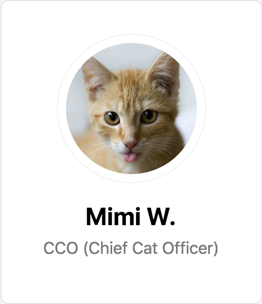
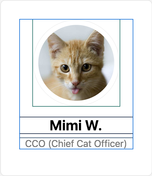
Consider this profile card taken from the Tachyons documentation. You can start by breaking down this layout into its various constituting components. There are many different ways you can approach this. I would personally break this down into: <Card />, <Box/>, <Avatar />, <Heading/> & <Text/> components.


As shown above, <Box/> and <Text/> are enhanced HTML elements. <Heading/> is an enhanced component that uses the level prop to decide which heading tag to render. <Card /> and <Avatar /> require a bit more work. Using the defaultProps HOC from Recompose you can provide some default styling. <Card /> is essentially an <article /> with a rounded border and some padding. And <Avatar /> is a circular image with a border.
export const Card = compose(
  defaultProps({
    bg: 'white',
    radius: 2,
    pa: 3,
    ba: 'black-10',
  }),
  withStyleProps
)('article');
Card.displayName = 'Card';

export const Avatar = compose(
  defaultProps({
    h: 4,
    w: 4,
    ba: 'black-05',
    pa: 2,
    radius: '-100',
  }),
  withStyleProps
)('img');
Avatar.displayName = 'Avatar';
Lastly, we can compose these components to create the <ProfileCard /> component.
const ProfileCard = ({ name, title, image, ...props }) => (
  <Card {...props}>
    <Box tc>
      <Avatar src={image} title={`Photo of ${name}`} className="dib" />
      <Heading f={3} mb={2}>
        {name}
      </Heading>
      <Text f={5} fw={4} color="gray" mt={0}>
        {title}
      </Text>
    </Box>
  </Card>
);
Tachyons-Components
Not everyone can or even wants to invest time into building a withDesignSystem HOC. I had a hard time maintaining tachyons-measured 😊 Luckily; Brent Jackson built a library called Tachyons-Components that gives you a slightly different but, faster way of building Tachyons design system components.
Instead of mapping props to the design system, it enables you to apply Tachyons class names directly as props. Using a styled-components like API you can set default styles when creating a component.
import styled from 'tachyons-components';

export const Box = styled('div')``;
Box.displayName = 'Box';

export const Text = styled('p')``;
Text.displayName = 'Text';

export const Heading = styled(({ level = 1, children, ...props }) => {
  return React.createElement('h' + level, props, children);
});
Heading.displayName = 'Heading';

export const Card = styled('article')`
  bg-white br2 pa3 ba b--black-10
`;
Card.displayName = 'Card';

export const Avatar = styled('img')`
  h4 w4 ba b--black-05 pa2 br-100
`;
Avatar.displayName = 'Avatar';
Then apply Tachyons classes as props when using the component to extend or customize its styles. Below you can see the complete profile card example recreated with tachyons-components.
<Text f5 fw4 gray mt0>
  {title}
</Text>
TL;DR use tachyons-components
Component-based design systems are a fantastic tool to make your product UI more consistent and improve the development workflow. By baking design decisions within the system itself, it reduces the number of decision that developers have to make. Therefore, allowing teams to make changes or build new features faster.
One restriction with Tachyons is that it does come with an opinionated set of design constraints. In part two I’m going to cover a different tool called Styled-System which gives you full control over defining your design system and uses a similar approach to withDesignSystem to expose the design system constraints as props.
