Chillwave
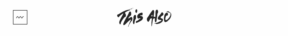
A few days ago I came across this creative studio called This Also. They just launched a new site. It not only showcases some of their amazing work but, also has this fun little loading animation.
I absolutely love this! First thing I did was right click & inspect element and was expecting to find an SVG with SMIL animation baked in. To my surprise it turned out to be a sprite based animation with 24 frames. So, let’s recreate this with only SVG.
Draw the Wave
Step one was obvious… draw the wave using the SVG <path> element. In Sketch/Illustrator you would create something like this using the pen tool. It’s a Bézier curve with 2 points – each with a handle (control point). The wave is simply a collection of this path alternating with its mirror image.

To create this path with SVG we will use the Bézier curve command c – lower case which means relative coordinates. We need to repeat this pattern several times, instead of trying to figure out the absolute location of each point we can use relative coordinates to make our life easier.
<!--
  dx1 dy1: control point for the start
  dx2 dy2: control point for the end
  dx dy: the end point
-->
c dx1 dy1, dx2 dy2, dx dy
The Building Blocks
For this example let’s assume that the width of the SVG element is w, the height is h and the wave has an amplitude of 0.25 * h. The path can then be constructed by:
- Moving to start point which will be the middle of the SVG (
0.5 * h) + half the amplitude (0.125 * h):
['M', 0, 0.625 * h];- Then we begin the curve
cand add the first control point. This is using relative coordinates so, the y coordinate is simply0. The x coordinate ismtimes the amplitude; wherem = 0.512286623256592433. The value ofmis chosen such that it approximately creates a sine wave.
['M', 0, 0.625 * h, 'c', 0.25 * h * m, 0];- Then we add the second control point. For the y coordinate we have to go up by one amplitude and up means negative in SVG. Therefore,
-0.25 * h. To calculate the x coordinate we go all the way to the end0.25 * hand come back by0.25 * h * m.
['M', 0, 0.625 * h, 'c', 0.25 * h * m, 0, 0.25 * h * (1 - m), -0.25 * h];- Finally we add the end point and create the path definition using the technique described in the react icons tutorial.
var pathData = [
  'M',
  0,
  0.625 * h,
  'c',
  0.25 * h * m,
  0,
  0.25 * h * (1 - m),
  -0.25 * h,
  0.25 * h,
  -0.25 * h,
].join(' ');The next path section is a mirror of the one above. Luckily SVG has the s command.
You can string together several Bezier curves to create extended, smooth shapes. Often, in this case, the control point on one side of a point will be a reflection of the control point used on the other side (to keep the slope constant). In this case, you can use a shortcut version of the cubic Bezier, designated by the command S (or s).
— MDN tutorial on Paths
Therefore, we can use the s command and extend our path definition. Remember the first control point is ✨automagically✨ inserted for us so, we only need to specify the 2nd control point and the end point of the second section.
var pathData = [
  'M',
  0,
  0.625 * h,
  'c',
  0.25 * h * m,
  0,
  0.25 * h * (1 - m),
  -0.25 * h,
  0.25 * h,
  -0.25 * h,
  's',
  0.25 * h * (1 - m),
  0.25 * h,
  0.25 * h,
  0.25 * h,
].join(' ');And Repeat
We can now use the s command technique to expand this wave – alternating between down and up.
// down
's', 0.25 * h * (1 - m), 0.25 * h, 0.25 * h, 0.25 * h;
// and back up
's', 0.25 * h * (1 - m), -0.25 * h, 0.25 * h, -0.25 * h;Move the Wave
To animate the wave we move the path from left to right using CSS transforms. The distance is equal to the width of the SVG element: transform: translate3d(-90px, 0 , 0). And we have to ensure that wave is long enough otherwise the animation doesn’t quite work.
The Finishing Touch
We could stop here, but you’ll notice that in the original GIF the wave has rounded ends. Adding that to a static wave is easy. We use stroke-linecap="round" and call it a day. But, in order to animate the wave its path extends beyond the visible SVG canvas.
The rounded ends are both somewhere offscreen. Therefore, to achieve the appropriate effect we have to rely on stroke-dasharray. The dash array takes values for lengths of dashes and gaps.
#wave {
  stroke-dasharray: 0 16 101 16;
}- We begin with
0since we want a gap to begin with but, by default thedasharrayapplies the first value to a dash. 16is then the length of the first gap.101is the length of the dash.- And finally
16is then the length of the last gap.
The total path is approximately 120px long. Using that as a starting point, I picked these numbers after a bit of trial and error.
At this point if we re-introduce the animation you’ll notice that it breaks the optical illusion of the wave staying in place as it oscillates. The path is moving left to right. To counter this movement we need to move the dash (yup, from the dasharray above) right to left at the same speed.
The gap + dash + gap = 16 + 101 + 16 = 133. And we can move the dash using stroke-dashoffset by exactly that amount – the now famous SVG line animation technique. Notice the difference. The one of the left doesn’t have the dashoffset and the one on the right does.
Update
Had to add the following fix for Safari. For some reason the SVG view-port is larger on it than other browsers.
<svg
  xmlns="http://www.w3.org/2000/svg"
  width="80px"
  height="60px"
  viewBox="5 0 80 60"
></svg>